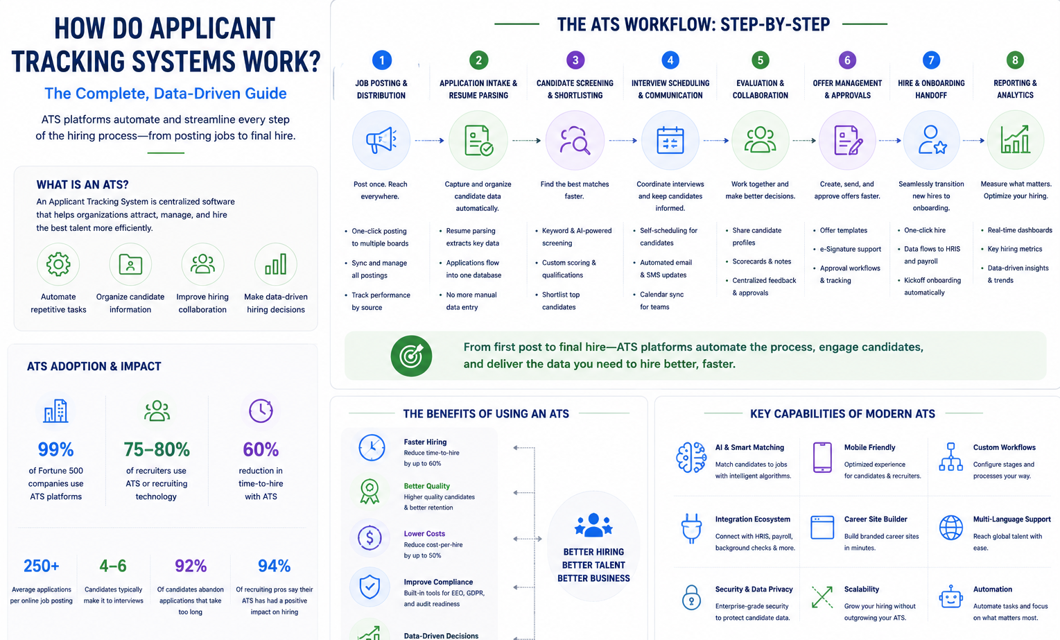

A recruitment dashboard transforms your hiring data into visual intelligence. Think of it as your hiring command center, a single screen that displays all your critical recruitment metrics through charts, graphs, and real-time indicators. Instead of digging through spreadsheets or switching between multiple reports, you get instant visibility into what’s working and what needs attention.
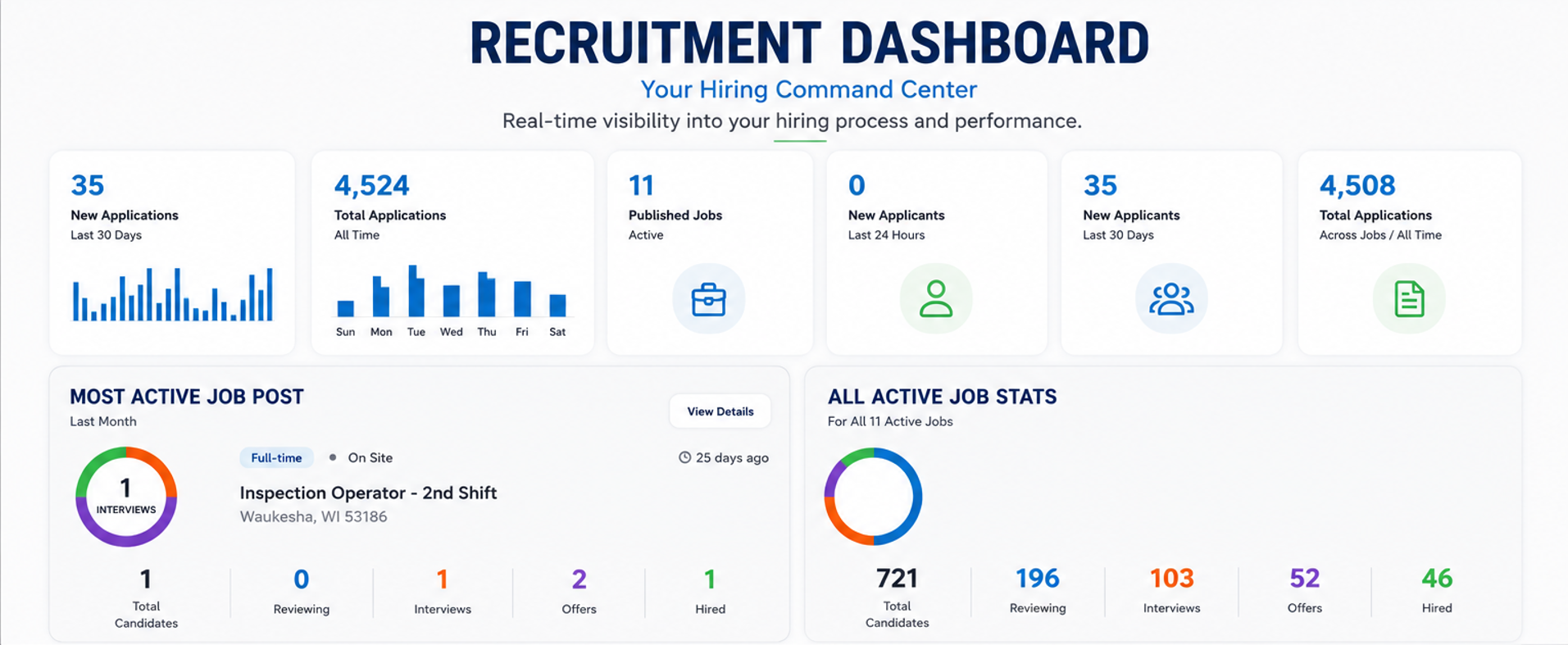
At its core, a recruitment dashboard is a data visualization tool that aggregates information from your applicant tracking system (ATS), job boards, and other recruiting channels. It presents this data through intuitive visual elements like funnel charts for your hiring pipeline, bar graphs for time-to-hire trends, and pie charts for source effectiveness. The best dashboards update automatically, pulling fresh data as candidates move through your process.
What sets a recruitment dashboard apart from traditional reports is its focus on actionable insights. While a standard report might tell you that 500 people applied last month, a dashboard shows you exactly where those candidates are in your pipeline, which sources they came from, and where they’re dropping off. It highlights anomalies, such as a sudden spike in time-to-hire for engineering roles or an unexpected drop in the number of diverse candidates reaching the interview stage.
Modern human resources (HR) analytics dashboards go beyond basic metrics. They incorporate predictive elements, showing not just current performance but trends that help you anticipate future challenges. For instance, if your dashboard shows declining application rates alongside increasing time-to-fill, you can proactively adjust your sourcing strategy before critical positions remain vacant for too long. This shift from reactive reporting to proactive monitoring fundamentally changes how recruitment teams operate, moving from gut feelings to data-driven decisions.
Why Recruitment Dashboards Matter for Modern Hiring
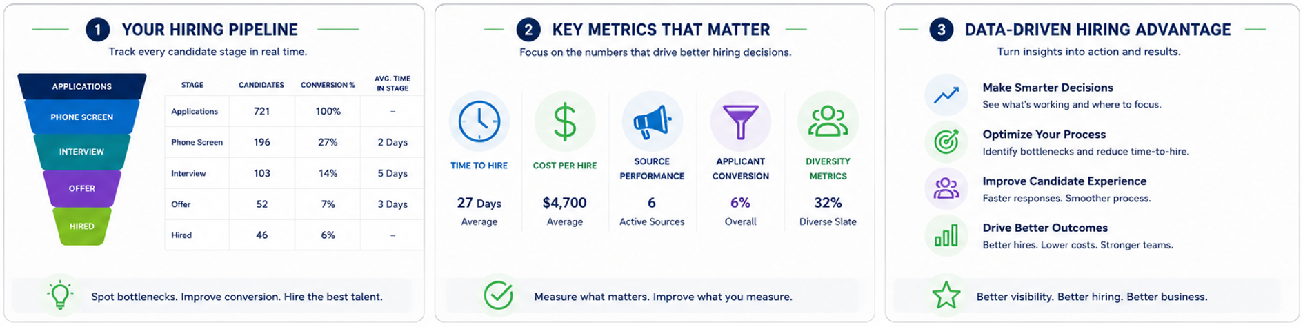
The difference between companies that excel at hiring and those that struggle often comes down to visibility. A recruitment dashboard provides that visibility, turning abstract hiring challenges into concrete, measurable problems you can solve. When you can see your entire talent pipeline at a glance, patterns emerge that would otherwise remain hidden in raw data.
Consider the impact on strategic HR decisions. Without a dashboard, you might sense that hiring is taking too long, but you won’t know if the bottleneck is in resume screening, interview scheduling, or offer negotiations. With proper visualization, you can pinpoint exactly where candidates stall and allocate resources accordingly. This precision transforms hiring from a reactive scramble into a strategic operation.
The benefits of data-driven recruiting extend beyond efficiency. Dashboards create accountability and alignment across your organization. When hiring managers can see real-time metrics showing their team’s time-to-hire averaging 60 days, rather than the company’s target of 30, conversations shift from opinions to facts. Similarly, when diversity metrics are visible to leadership, it becomes impossible to ignore imbalances in your hiring funnel.
Most importantly, dashboards enable continuous improvement. By consistently tracking hiring key performance indicators (KPIs), you build a baseline for performance. From there, every process change becomes measurable. Did that new job board actually deliver better candidates? Did simplifying your application reduce drop-off rates? Without dashboard visibility, these experiments become guesswork. With it, you build a culture of testing, learning, and optimizing that compounds over time into a significant competitive advantage.
Core Metrics Every Recruitment Dashboard Should Track
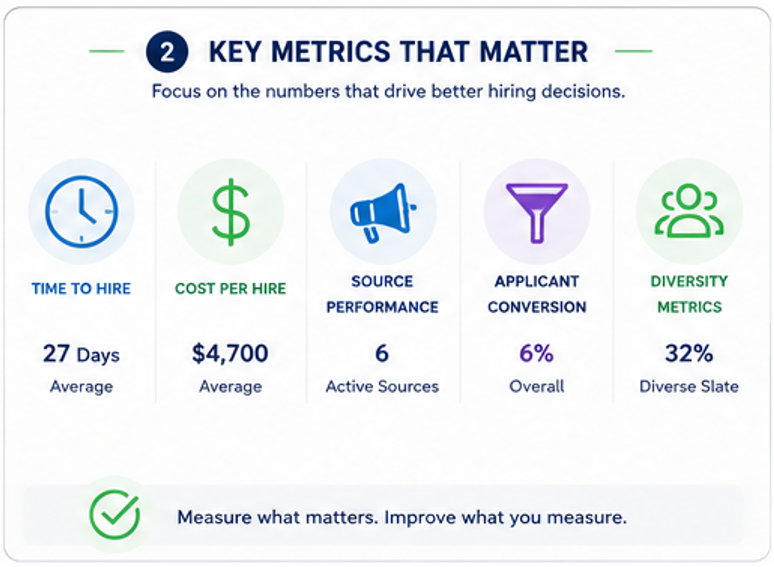
Not all metrics deserve dashboard space. The key is selecting indicators that drive action and align with your hiring goals. Based on industry best practices and real-world impact, five metrics form the foundation of any effective recruitment dashboard.
Time-to-Hire & Time-to-Fill
The average time to hire globally currently sits at 44 days. This metric measures the duration from application to first day on the job, revealing the true candidate experience. Time-to-fill, by contrast, starts when the requisition opens. Both matter, but for different reasons.
Tracking these metrics by department, role type, and recruiter uncovers hidden inefficiencies. For example, if technical roles consistently take 20 days longer than sales positions, you might need specialized sourcing strategies or streamlined technical assessments. The goal isn’t just to reduce time-to-hire blindly; it’s to identify which delays add value (thorough vetting) and which frustrate candidates and increase drop-off.
Cost-per-Hire
Understanding your cost per hire formula starts with aggregating all recruiting expenses (advertising, recruiter time, screening tools, and onboarding costs), then dividing by the number of successful hires. Industry benchmarks place average cost-per-hire around $4,700, though this varies significantly by role complexity and seniority.
The real power comes from breaking down costs by source and stage. If agency hires cost $15,000 while employee referrals average $2,000, that data shapes your recruiting budget allocation. Similarly, tracking costs by hiring stage reveals where to invest or cut. Perhaps those expensive technical assessments aren’t improving quality enough to justify their price.
Source of Hire
Knowing your best recruiting channels transforms how you allocate time and budget. A comprehensive source analysis tracks not just volume but quality, which channels deliver candidates who get hired, perform well, and stay longer.
Effective hiring source tracking goes beyond simple attribution. It considers the full journey; a candidate might discover you on LinkedIn, research on Glassdoor, and apply through your career site. Modern dashboards use multi-touch attribution to give credit where due, helping you understand the true value of each channel in your recruiting ecosystem.
Applicant Drop-Off Rate
Research shows 60% of job seekers abandon applications that are too long or complicated. Your candidate drop-off metrics reveal exactly where you’re losing potential talent, after the initial application, before assessments, or during interview scheduling.
To improve application completion, dashboards should show stage-by-stage conversion rates. If 40% of candidates bail after seeing your 45-minute assessment, that’s actionable data. Smart companies use this insight to streamline processes, removing unnecessary friction while maintaining quality filters.
Diversity & Inclusion Metrics
Diversity recruiting statistics have moved from a nice-to-have to a business-critical priority. Effective dashboards track representation across gender, ethnicity, age, and other dimensions at every pipeline stage, not just final hires.
A true diversity, equity, and inclusion (DEI) dashboard reveals where bias might creep in. If your applicant pool is 40% female but only 20% of hires are women, the data suggests issues with your selection process. This visibility enables targeted interventions and demonstrates commitment to inclusive hiring practices.
How to Design an Effective Recruitment Dashboard
Creating a recruitment dashboard design that actually drives action requires balancing comprehensiveness with clarity. Start with the primary users on your dashboard. Executives need high-level trends while recruiters need operational details. The best dashboards serve both through a layered information architecture.
Visual hierarchy matters. Place your most critical metrics (perhaps overall time-to-hire and current pipeline volume) prominently at the top. Use large, bold numbers for these KPIs with color coding to indicate performance against targets. Green for on-track, yellow for concerning, red for critical. Below these summary metrics, arrange detailed visualizations that tell the story behind the numbers.
Following HR dashboard best practices, each metric should have its optimal visualization type. Funnel charts naturally represent your hiring pipeline, showing volume and conversion at each stage. Time-series line graphs best display trends, such as time-to-hire, over months. Pie or donut charts work well for source mix or diversity breakdowns. The key is consistency; once users learn your visual language, insights come faster.
Interactive elements transform static reports into exploration tools. Filters by department, time period, or job type let users dig into specifics without cluttering the main view. Hover states can reveal additional context. Hovering over a high time-to-hire might show which specific roles are dragging the average up. Drill-down capabilities let recruiters click from summary metrics into individual candidate details.
Remember that the best data visualization tips emphasize restraint. Resist cramming every possible metric onto one screen. A cluttered dashboard overwhelms users and obscures key insights. Instead, create focused views for different use cases: an executive summary, a recruiter operations view, and perhaps a diversity-focused dashboard. This segmentation ensures each audience gets exactly what they need without noise.
Choosing the Right Recruitment Dashboard Software
Selecting the best recruitment dashboard software starts with understanding your current tech stack. If you already use an applicant tracking system, check whether it includes built-in analytics. Many modern ATS platforms offer dashboard capabilities, though depth and customization vary significantly.
Stand-alone ATS analytics tools can supplement basic ATS reporting with advanced visualizations and predictive capabilities. These specialized platforms often integrate with multiple data sources, including your ATS, human resources information system (HRIS), job boards, and even communication tools, to create comprehensive views. The trade-off is additional cost and complexity versus the richer insights they provide.
When evaluating options, prioritize these capabilities: real-time data refresh (nobody wants yesterday’s numbers), mobile accessibility for on-the-go monitoring, automated alerts for metrics outside normal ranges, and export functionality for sharing insights. Custom report builders matter too; your recruiting process is unique, and your dashboard should reflect that.
For HR tech comparison, consider both immediate needs and future scale. A startup might start with basic ATS dashboards, but should choose a platform that can grow into sophisticated analytics as hiring volume increases. Enterprise organizations need robust security, role-based access controls, and potentially application programming interface (API) access for custom integrations.
Don’t overlook user experience. The most powerful analytics mean nothing if your team won’t use them. During demos, have actual users test the interface. Can they find the metrics they need quickly? Is creating a custom report intuitive? Remember, adoption drives value; choose software your team will actually embrace, not the one with the most features on paper.
Ninja Gig Recruitment Dashboard: Features & Benefits
The Ninja Gig dashboard takes a different approach to recruitment analytics; everything lives in one unified view. As they put it, “See every applicant, no matter where they applied. One dashboard. One login.” This solves a fundamental problem in modern recruiting: candidate data scattered across multiple job boards and systems.
Their Management Console serves as mission control for recruiting teams. The dashboard displays job posting performance metrics at a glance, letting recruiters navigate to active jobs and important pages without hunting through menus. Built-in widgets show real-time stats on new applicants, pipeline status, and key performance indicators. For teams juggling multiple openings, this centralized view eliminates the constant context-switching that kills productivity.
What sets Ninja Gig’s hiring analytics features apart is the integration of compliance tracking directly into the dashboard. Their system includes Equal Employment Opportunity Commission (EEOC) and Office of Federal Contract Compliance Programs (OFCCP) compliance tools built in, automatically tracking diversity metrics required for regulatory reporting. Rather than scrambling to compile diversity data for audits, it’s always up to date and accessible. This proactive approach to compliance reduces risk while supporting genuine diversity efforts.
The platform’s applicant tracking system feeds data seamlessly into custom reports. Recruiters can build tailored views by selecting specific fields, applying filters, and choosing date ranges. Want to compare time-to-hire across departments? Or identify which sources deliver the most diverse candidates? These reports can be saved, scheduled, and automatically distributed to stakeholders. The result is a system where insights flow naturally from data collection through visualization to action.
For growing companies, Ninja Gig’s approach offers particular advantages. Since all candidate data flows through one system regardless of source, you get accurate metrics from day one. There’s no data cleanup or integration project required, just consistent, reliable analytics that scale with your hiring needs.
Building Custom Reports That Drive Action
Generic reports tell you what happened. Custom recruiting reports tell you what to do next. The difference lies in tailoring analytics to your specific challenges and goals. Start by identifying the decisions you need to make regularly: which sources to invest in, where to focus process improvements, or how to balance speed with quality.
Effective custom reports begin with clear questions. “Which job boards compiled the best candidate profiles?” leads to a source-quality analysis that compares not just application volume but also progression rates and eventual job performance. “Are we meeting diversity targets?” spawns reports that track representation at each funnel stage, revealing where underrepresented groups drop off.
Segmentation unlocks insights hiding in averages. Overall time-to-hire might look acceptable at 35 days, but segmented reports could reveal engineering roles averaging 60 days, while sales positions fill in 20. Similarly, filtering by recruiter, location, or seniority level exposes patterns that aggregate data obscures. These granular views enable targeted interventions rather than one-size-fits-all solutions.
Scheduled HR reports create accountability through consistency. Weekly pipeline reports keep hiring managers engaged with their open roles. Monthly source effectiveness analyses ensure marketing spend aligns with results. Quarterly diversity progress reports demonstrate commitment to DEI goals. Automation ensures these insights arrive reliably without manual effort.
The most impactful recruitment KPI reports tell stories, not just statistics. Combine metrics that provide context: pair time-to-hire with quality-of-hire scores to ensure speed doesn’t compromise standards. Show offer acceptance rates alongside compensation benchmarks to guide competitive positioning. These multi-dimensional views prevent the tunnel vision that comes from optimizing single metrics in isolation.
Real-World Results: Companies Cutting Time-to-Hire with Dashboards
Dashboard implementation delivers measurable results when companies commit to data-driven hiring. One recruitment dashboard case study involves a 500-person technology company struggling with a 65-day average time-to-hire for engineers. After implementing comprehensive dashboard tracking, they discovered their bottleneck: technical assessments took an average of 12 days from assignment to completion.
Armed with this insight, they restructured their process. Instead of lengthy take-home projects, they moved to shorter, time-boxed assessments that candidates could complete immediately. The dashboard showed results within weeks: assessment completion jumped from 60% to 85%, and time-to-hire dropped to 42 days. This reduced time-to-hire example demonstrates how visibility enables targeted solutions.
Another organization, a retail chain hiring thousands annually, used dashboards to tackle diversity challenges. Their data revealed strong, diverse representation in applications, but steep drop-offs after phone screens. The investigation showed unconscious bias in their screening questions. After revising their approach and tracking results through their dashboard, they increased diversity hires by 40% within six months while maintaining quality standards.
These hiring success stories share common elements. First, dashboards revealed specific problems rather than general dissatisfaction. Second, teams could test solutions and see results quickly. Third, sustained improvement came from continuous monitoring rather than one-time fixes. The dashboard didn’t just report on hiring; it became the platform for systematically improving it.
Implementation Checklist & Best Practices
Successful recruitment dashboard implementation follows a predictable pattern. Start with stakeholder alignment; gather your recruiting team, hiring managers, and executives to agree on which metrics matter most. This prevents the common mistake of tracking everything possible rather than what drives decisions.
Your HR analytics rollout checklist should include: defining primary KPIs (limit to 5-7 initially), mapping data sources and ensuring quality, choosing visualization standards, setting performance benchmarks, creating user access roles, scheduling automated reports, and planning training sessions. Don’t skip the training; even intuitive dashboards benefit from guided tours that show users how to find insights relevant to their roles.
Follow these dashboard best practices for sustained success. First, start simple and expand gradually; begin with core metrics before adding advanced analytics. Second, establish data governance early by designating who maintains data quality and accuracy. Third, create feedback loops in which dashboard insights trigger process improvements, generating new data to track impact.
Common pitfalls include overwhelming users with too many metrics, focusing on vanity metrics that don’t drive action, neglecting mobile optimization for managers on the go, and treating the dashboard as a one-time project rather than an evolving tool. The best implementation plan for iteration is to gather user feedback quarterly and adjust views based on actual usage patterns.
Remember that technology enables but doesn’t guarantee success. The real transformation happens when teams embrace data-driven decision making, using dashboards not just to report on the past but to actively shape better hiring outcomes.
Next Steps: See Your Recruitment Data in Action
Ready to transform your hiring process with data-driven insights? The next step is to see how a comprehensive recruitment dashboard integrates with your actual recruiting workflow. Book a Ninja Gig demo to explore how unified analytics can streamline your hiring process, reduce time-to-hire, and improve the quality of your talent pipeline. Our team will show you how to track the metrics that matter most for your organization.
Get Your Free Recruitment Dashboard Template
Ready to put these insights to work? Download our free, Excel-ready Recruitment Dashboard Template and start visualizing your KPIs today.
Our template auto-calculates time-to-hire, cost-per-hire, source efficiency, and diversity ratios, plus a bonus step-by-step setup guide. Enter your email to get instant access.
Related guides
- Applicant Tracking System Best Practices: Expert Guide for Faster, Fairer Hiring
- Managing Your ATS in Small Teams: Best Practices for Pipelines, Statuses, Tagging, and Dashboard Tracking
- How Do Applicant Tracking Systems Work? The Complete, Data-Driven Guide
Ready to put these ideas to work? NinjaGig is an affordable applicant tracking system for small businesses with built-in hiring dashboards — post to every major job board and manage all your applicants in one place.